Well! I spent many, many hours searching for something: video showing Jareth without his ball coat on. After I posted the costume study part 1, TWO people commented with it! Like the Sarah study 2.5, this one isn’t a full study in its own, but rather an addition that is substantial enough to be a new post, but not enough to be a full part.
Angela is to thank for the gif to the right, and Glass Spider found the video below, which shows the gif starting a few seconds before it and going to a few seconds afterward.
So the cummerbund-vest thing is a cummerbund that closes in the back with suspenders. The second photo shows that the front is a good few inches higher than the back.
These vides and photos confirm that the shirt closes in the front. They also show some sleeve detail, such as the very narrow cuff at his wrist, and slight gathering at the top of the sleeve. This next photo shows the top the best. They stumbled down some stairs, and were laughing.
Thank you to Angela and Glass Spider!
Laura brought up a bit she found in a book that I actually have ordered, but is back-ordered until next week. Since I had more time than anticipated after an appointment today, I managed to get to a bookstore in Portland that has it. (On the best of days, it can take 20 minutes to find parking, but then add in a bunch of construction…yet I managed to find immediate parking and got around the construction.). That book is called David Bowie: A Life, and it’s a book made up almost entirely of what those who have worked with him or who knew him had to say, as well as passages from David himself.
Said Brian Henson, son of the esteemed Jim Henson:
My dad was a little worried about the sexual connotations of the relationship between Jareth and Jennifer Connelly, but then that’s what the movie’s really about. I do know that David’s codpiece had to be reduced as it was far too large originally. The whole movie is about the aggressive phallus, as Jareth represents male sexuality.
Despite not being the review I read, this confirms the slight enhancement.
The next passage was by Steve Whitmire, a puppeteer on the film.
…I know there is some kind of online cult surrounding his “package,” and my understanding is that David as not altogether happy with his costume choice. Regardless of whether or not he wanted to play a seductive character, I don’t think he was crazy about his leotard. There are a couple of shots in the film that really focus on his groin, but they’re actually focusing on characters next to him, and it just looks that way. They just happen to be only waist tall.
And, though this isn’t related to costuming, I thought it was interesting anyway. It is all by Whitmire.
I know that his son, Duncan, wore in the creature department on that film, as a puppet builder. He was there for a few years.
I had no idea that David Bowie’s son was into puppetry! Toby Froud, son of costume designer Brian Froud and Toby, as in the babe whose got the power, is into puppetry and special effects, and is actually local to me now. He works as LAIKA, which has produced films such as Coraline. I don’t know about the rest of you, but Labyrinth makes me want to go into puppetry. My daughter and I having puppets who ensemble muppets doesn’t help matters. 🙂
Would anyone be interested in a pattern to make Ludo? The original Ludo toy was at the exhibit, and I’ve been toying with the idea of making that as a pattern.
So long until next time! I’ve got my work cut out for me in trying to convince my husband to let me make him into a Jareth model.
So I had this done and posted once before, and then it disappeared. Due to the time it takes to go though more photos than I care to think about, to find the best ones, and then to try to analyze it all, and how busy my schedule has been, I haven’t had the time to redo it. But now? Well. I have a bit of time before me, and so here I am! Skip the next section to get right to the study.
First, though, I had people on my Facebook page encourage me to start a Patreon page. I hesitated a lot, and sought advice from several people. See, to me, if feels like begging. I can see now why some of my favorite YouTubers and bloggers hesitated so much, and mentioned it like they were pups with their tails between their legs. (Awwwww, look at the cute Bowie doggy!) I always thought it was completely fair that they start them. They were spending their time and money creating stuff to give away for free. But I’m a hypocrite since, when it comes to me, I’m not taking the advice I’d post to them to just do it. But the reality is these studies cost a good deal of money. I’m about $1,000 in for just these two Labyrinth ensembles, not including the time, and, rather than keeping this info to myself to try to lure in commissions, and giving it away which can actually cost me commissions on top of the money I’ve spent. I took a daytrip to London (literally arrived in the morning from out of the country, left that evening back out of the country–border patrol was very curious about why an American was making such a fast trip to England) literally just because I found out a museum had a couple popular regency ensembles on display, and I thought those would make excellent studies. Well, a Patreon really could help offset the costs, both cash out of pocket as well as the time these take, and enable me to do more of them and faster. So I did it. I started one. Aria Couture is on Patreon. There are different levels, including access to far more photos than make the cut for these studies, not only for these Labyrinth studies, but for all of them that I do.
This next part will only matter to those who are claiming my photos as their own: Stop trying to claim the rights to my photos. I traveled a few hours away multiple times to get these photos, paid the cost of parking in downtown Seattle, and a hotel, because driving that round trip in a day is just exhausting. So getting these photos wasn’t at all inexpensive. I’ve spent a tremendous amount of time analyzing the construction the best I can, figuring out the ways that disclosed supplies were used (hot glue…?), and anything else I can about them. Prior to my photos, there were no clear photos of either of these ensembles online, at all, and only one known full photo of the Sarah gown, which was a small, blurry photo in Labyrinth: The Photo Album. Thus far, all I’ve asked in return is that I receive the credit for these photos I’ve taken. So please, PLEASE work with me on this. There’s absolutely nothing to be gained by trying to claim my photos as your own. But there is a lot for all of us to lose.
– – – – – – –
Now, this is a study best broken down into at least four posts, one on the boots, trousers, shirt, and under-waistcoat, one on their recreation, one or two on the jacket, and one on the hair and makeup to complete the look.
Let us start with the easiest part: The boots.
The are patent poly vinyl, a very inexpensive material in the early 1980’s, and still inexpensive now. Folks, the supplies used really were considered cheap at the time, and most are still fairly cheap now (hot glue…). So, of course, this means that finding some of the supplies (Sarah’s ball gown fabric) is very difficult and costly. Because of course it does. For reasons. That’s why.
(Really, it’s due to fabric stores collapsing into fewer, which means that they don’t need to compete with each other by having different fabrics at lower prices. For instance, when Hancock’s closed, and left JoAnn Fabrics as the only dog in town in nearly every market they were both in, JoAnn Fabrics really don’t need to have a large variety or low prices to get local business. Where else are shoppers going to go? So this means that they’re going to carry less variety at some shockingly high prices that are still ridiculously high after coupons. A lot of websites are also starting to stock the exact same fabrics because that’s what the mills are making. As cheap fabrics rise in price due to the lack of competition, the nicer fabrics are bumped up as well.)
So back to the boots. They could hardly be simpler, which…say it with me…of course means finding anything like them is difficult. It doesn’t help that most boots now have zippers on the inside because consumers don’t like to use the energy to pull on fitter boots, or to actually have to tie them (and consumers write negative reviews about the rare pairs that don’t have zippers). These are about as basic of a style as can be, just a cuffed pirate-style or Robin Hood-style boot. Even then, a lot of those are more detailed. These are the closest I’ve found, and even then, all of them would need some modifying. Click on the pics to be taken to their listings:
The first pair, which is the most expensive and made of leather, doesn’t have a zipper. Both of the other pairs do. The second pair would need the cuff piece cut to be straight, and all of them need to be polished to a shine with a patent polish. If the last pair was stiffer instead of slouching, and had no zipper, those would be the closest. They have the same tongue detail in the front and everything. The second would also be close, if they didn’t have the longer zipper and pointed cuff. The first is nearly perfect, except that that pair lacks the tongue detail.
On to the trousers. Let’s just get the giggling out of the way. I try to keep this blog family friendly, but there is no getting around that crotch. How many of us got our first inkings while watching this movie, and we didn’t understand it? How many of us now still…oh, never mind. *giggles* Anyway, that’s not on accident. Jareth’s mindless toying with some balls… No, not at all on accident. This movie overtly deals with sexual awakening. Part of that is drawing attention to sexuality, and what better way than to highlight the genitalia of a major rock star?
There’s no way to avoid the subject. Jareth’s pants are undeniably tight, undeniably revealing, and, at first glance, almost over the line for the garb of an adult male character in a film with a young teenaged heroine. “We got in a bit of trouble about ow tight his pant were,” [Brian] Proud admits, “but the choice was deliberate.”
Within the contest of the film, Fraud explains, those pants are representative of that young innocent girls’s imagination. “We’re not looking at reality. We’re inside this girl’s head. Jareth has the tight pants because he is many, many things that a teenaged girl related to. He is a rock star.”
So, yes. There’s just no way to be professional when talking about it. I’m sorry, folks, I’m one of those who crushed on Bowie and couldn’t explain it at the time, and now my 8-year-old has a major crush on him and believes he is literally a god.
These high-waisted trousers, but really, we can call them leggings, are make of velour with some stretch to them. That plays up The Bulge better than a woven-backed velvet. As you can see, there isn’t a center seam. Those are so uncomfortable and can create camel-toe. Not so comfortable. Or attractive. The seams instead are from the waist, starting perhaps 12″ across, then heading down and following the groin. This solid piece in the front both I framed by those seams and will smooth and mold better to highlight what’s underneath. (No one knows how hard it is to write this post without laughing.) I shall presume that the back has the standard single seam. Though Bowie was said to be naturally endowed and in need of no help in that area (warning: those links should only be clicked by those who are okay with frank discussions of adult matters), some way was used of “enhancing” what what there. I doubt this was built-in padding in the trousers, but more likely a dance belt with some sort of padding in that. Since I can’t find what I think would be an acceptable image to post, you can see what a dance belt is on this page from Discount Dance. If there was nudity, then that page wouldn’t show it.
I have spent an absurd number of hours trying to track down a video someone told me about that shows Jareth with his ball coat off, showing it to be a vest that is low cut in the front.
A leafy gold metallic brocade was used. I thought it looked like a cummerbund because there is no closure in the front. now, it’s possible that it’s got a full back that closes in the back, or my source may have been mistaken. At this point, the construction would speculation since, in a good 20 hours of searching and watching videos and pouring through photos and stills, I haven’t been able to find anything to hint at either direction. What’s for sure is that there is no front closure that would indicate a vest, though a vest cut still makes more sense than a cummerbund.
Now on to the shirt. Once more, we are left to speculate on the closure. It could be buttons or hooks under the ruffle, or closing somehow in the back. The ruffle is full enough that it would easily close in the front, likely with hooks and eyes. Much easier than dealing with buttons. What we can see is the neck and those ruffles.
The fabric is silk. The texture in the photo below looks like sueded/sanded silk charmeuse. This is a glorious fabric. Some sort of interlining is definitely used in the neck to be able to support that brooch. The light dove silk, called silver in the Labyrinth: The Ultimate Visual History, is roll-hemmed with a medium grey thread. The ruffle is made from a curved piece of fabric, not a single piece gathered down the middle. The clue on this is how the ruffles lay in those folds. The way that those wedge-shaped folds happen is for there to be more length at the edges than in the middle. A standard gather would have as much fabric in the middle, which would impede the ability for the folds to lay forward. The Sarah gown doesn’t use any unusual methods. But this one? Creative uses ahoy! I don’t know if there’s really a name for the method of making this sort of ruffle. This is something I will demonstrate in part 2 of this study. That’s why I want to make this one along with just talking about it and showing photos.
The final piece of his ensemble, aside from his coat, is that brooch. Unless polished regularly, I doubt it’s sterling silver. It’s possible that it was polished before display, but that would be such a pain that I doubt it was done. Just look at the lack of tarnish even inside the loops of chain. The way the metal has aged looks like that nickel-free metal used in a lot of inexpensive jewelry findings. Considering the complete lack of materials and supplies that would have had to be custom-made with special equipment rather than things that could possibly be found on the stash of typical seamstresses/tailors and jewelry-crafters, this was probably fabricated using whatever mass-produced jewelry findings could be found. The dangles to the sides are on pieces of craft chain with black teardrops, possibly plastic, and the piece down the center is similar to vintage pieces of costume jewelry that I’ve seen, but broken in half, with black cabochons glued on. The top part of the pendant has lost a couple of them. The glue has even yellowed over time. A cabochon on each side is missing. There should be four, as show in the gif below. The faceted jewel in the center is almost certainly plastic. There’s a larger one farther down. The facets are quite large and too perfect to be cheap glass, which are almost always irregularly cut, but don’t have enough shine to them to be glass or crystal. Glass is cut, with lower quality being done too quickly to be perfect, but plastic is molded.
That’s something I love about these ensembles. Cellophane, hot glue, chunky glitter…these beautiful creations were made out of standard craft supplies, and that’s so freaking cool and creative and inspiring and shows that the humblest, most-accessible things can be used to make things that people will still be drooling over over three decades later.
If there’s anything here that isn’t too clear, please comment below to let me know, and I’ll make sure to cover that in part 2 of this study.
This isn’t really a full post, but it’s worth mentioning. While double-checking on a quote in a book I have, I found this:
Thirty years on, Connelly still remembers the dress she wore: a billowing silver-white ball gown of iridescent fabric, with puffed sleeves a silver lace bodice, and a pannier, or hooped petticoat, beneath the skirt. “It was so elaborate,” she says. “And it was made of such unusual fabric. I thin there may have been some cellophane in it.”
“We made her dress out of silver lamé and iridescent rainbow paper, overlaid with lace and jewels on the bodice,” recalls Ellis Flyte. “We had costume breakdowns and a color chart on every character, and in this scene, her silver and mint color pallet se her apart from the others in the ballroom. Lovely young Jennifer suddenly was a beaitoul princess. Her hair was dressed jeweled glue particles. It all took a great deal of work, but she did look otherworldly!”
“Oh, that enormous hair!” Connelly gasps today. “Who can forget that?” The hairdressers opted not to give her an elegant updo; instead they wove delicate tendrils of silver through her dark hair, like enchanted spiderwebs.
This is from Labyrinth: The Ultimate Visual History. It’s a beautiful book. I paid the full $45 for it, and don’t regret it. If you want to buy it on Amazon, here’s my affiliate link to it (and you an read other reviews) where I’ll get about three cents, but it’s really worth going down to your local Barnes & Noble, Powell’s, or what-have-you, and coughing up $45 for both this book as well as to help keep brick-and-mortar stores from going the way of the dodo.
Anyhoo! I thought that piece is something interesting enough to bring here. Back to finalizing post numero uno in the Jareth set!
NEW HI-RES PHOTOS and updated information! Click on any photo to see a ton more detail. The photos shown here are large, and will get much larger (thousands x thousands for the resolutions) when clicked.
As promised, I returned to MoPop with my real camera instead of my iPhone camera. I already gave a good deal of information in the first post on this gown. So this post will be mostly photographic, with commentary on new information or things to pay extra attention to beneath some photos. Some shots will be close to the same, but sometimes a lightly different angle shows something just differently enough for it to be clearer. I’ll upload more of these photos to this Facebook album today, though the resolution might get squished.
This one shows the necklace very well. Through studying the beadwork, I was able to determine that I was incorrect on the neckline missing trim. Let’s look back at the gown on Sarah:She has a yellow flower on her right shoulder, but there isn’t one on the right shoulder on the mannequin. BUT! Through studying the beading and lace pattern, I was able to see that this photo of Sarah has been flipped. So that flower isn’t missing. It’s on the mannequin’s left shoulder, and In the film itself, it is also shown on her left.
If you look hard, on the left sleeve you can just barely tell that there’s a larger opaque poof just at the top. It looks like a floating ball of pink. Below that is cellophane with a lace overlay.
Starting just under the big shiny spot toward the top right by the right sleeve, you can juuuuuust past out the beginning of the front bodice seam.
The ground of the lace is in a diamond pattern.
The back of the necklace is seed beads on wire with a basic spring clasp and a chain hanging down the back.
The bottom edge of the bodice is piped.
The neckline of the bodice is piped. You can also see how the lace is pieced on and stitched down rather than being a solid piece of shaped lace. If you look closely at the left arm, you can see the shadow of its outline.
The bodice closes with what appears to be ten hooks and eyes.
The fullness of the sleeves is concentrated toward the top.
In the following pictures, pay special attention to the edges of the lace. Two types were used, an eyelash lace for the front half, and a different lace in the lack.
This photo shows the two types of lace. This is from the back on the right side. The lace father away, which looks to be our left, is the eyelash, while the lace on the right that comes back toward the camera, isn’t.
The edge of cellophane!
The piecing on the skirt edge is easy to see here.
Check out the zig-zag edge.
Here is that repair I mentioned in the last post.
I was incorrect about the lace last time. It looks irregularly crinkled, but upon closer look, it looks like the organza was pulled and pulled until the fibers were all pulled out of shape.
A pretty decent view of the front lace pattern.
I hope these additional photos are of some help to some of you! I’m already sourcing fabrics for a couple inquiries as my schedule allows me too, and my daughter wants one as well. Because of course she does. She loves fancy things. Like mother, like daughter. 🙂
Up soon…Jareth! Subscribe to get notified of the one. It’s a few weeks out yet. My commissions schedule is too busy for me to start breaking that one down!
UPDATE: NEW clearer photos taken with the Canon camera I forgot the first time I went with NEW information (like how it closes, and how the lace is done, as well as where some of the bodice seams definitely are under the lace). You can find those new photos and some updated information on this news page!
~*~*~*~*~*~*~
On Monday, during a Girl Scout meeting (during a time when the girls were doing an activity we adults couldn’t help with), I saw that the ball ensembles from Labyrinth were in Seattle, and I screamed and freaked out my troop. But…Labyrinth! And since there are stunningly few photos available showing Sarah’s ball gown in any detail, I knew I had to go. So on Tuesday, after our ballet classes, my daughter and I started the 6-hour drive (stopped for the night after an hour and a half, then the next morning, we hit rush hours traffic through several cities, including Tacoma as well as Seattle, though the return drive was a mere 4.5 hours) drive up to the Museum of Pop Culture. One membership purchase later…
All photos open larger when clicked.
And these weren’t the only ensembles of the day. Stay tuned for Princess Buttercup’s wedding gown from The Princess Bride, and Dorothy from Wizard of Oz (yes, this has been done before, but I got information I haven’t seen mentioned elsewhere), among others! Subscribe to this blog at the bottom of any page to get notifications when those go up I will also do a separate study on Jareth’s ball ensemble. This study will stay focused on Sarah’s gown.
If you need a refresher, take a couple minutes and enjoy this video.
I suspect that designers Brian Froud (father of Toby Froud, who played the baby in the movie quite by accident) and Ellis Flyte had a lot of fun with these pieces. I’ll save a bit of trivia about Jareth’s ensemble for the study on his at a later time.
To start, how about a couple videos I took?
Spoiler alert: You can skip all the text and go right to this Facebook album I set up for this gown to look at pictures, but surely you wouldn’t want to skip reading all this information. 🙂
Photo 2
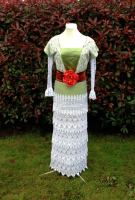
Let’s begin this discussion with the skirt. Not including the pannier under it, this skirt is six layers. The bottom layer-sandwich is a lining of cotton muslin with an iridescent layer that looks like yellow-tinted cellophane (certainly not the iridescent fabric we can fine easier today), with a layer of soft white, almost a very soft dove grey, and silver lace. The cellophane is scalloped at the bottom. Each scallop is about 4″ wide. The lace is a synthetic fiber, and also has a scalloped edge. For the 80’s, back when everything was higher quality, this was a cheap lace. These days, it’s a higher quality lace. How ironic.
Photo 3
The top layer-sandwich is similar. It’s backed with muslin, and the cellophane is the sort that is pinkish green. In photo 2, you can see that the two cellophane layers are different shades. This cellophane is scalloped at the bottom, but I couldn’t see the edges in the lifted part to tell if it’s also scalloped, or cut straighter there. The pinkish cellophane is topped with a fabric I haven’t seen since the 80’s, and haven’t been able to track down yet. It’s not quite a crinkled organza, more puckered similar to seersucker, but in wider, irregular stripes, and it has silver threads running through it. I’m not even sure if this exact fabric is even made anymore, though I do recall having a dress made with it when I was a kid.
Photo 4
An interesting thing I noticed is that on the far sides, additional stripes are added at the very bottom, about 3″ at most, and tapering down. At first I saw it only on the right side, but upon closer looking for quire a while, I was able to make out the extension on the other side. I speculate that the reason for this is that the fabric, which was used lengthwise around the gown instead of in panels, wasn’t wide enough to go from the waist, over the panniers, and to the floor, or wherever they decided to hem it (could have been ankle length, I don’t know since I don’t know Jennifer Connolly’s height). Had those sides been left shorter, it would have been noticed, and shortening the entire gown 3″ would have been noticed. The extensions are sewn on with zigzag stitching. In photo 4, you can see a darker line from the right side that angles down. This is one of the extensions. In my first video, at 44 seconds in, I point it our clearer, and for the one on the right, it’s at 2:19 on my second video.
The hemming on the muslin and topmost layer are just zigzag-stitched, which is very, very, very, surprisingly common on film gowns. It’s not like viewers are going to see the hem or inside seams, and rarely do these gowns have to last for months on end, of not years, the way Broadway and opera gowns need to. I doubt anyone noticed the repair to the hem in the back, and I’m going to include people who go to see this gown in person. Even in person, these small details are only going to be noticed by people who are looking for them. Like me, and the people who are interested enough in this gown to find this post about it.
Photo 5
The fabric in both front and back are gathered in deep Kingussie pleats, 11 to each side. The best way to describe these pleats, since this type isn’t often called that, is knife-pleating where the edges all point one way on one half, and the other way on the other half. On this gown, the pleats on each half point toward the center, either back center or front center. They aren’t very regular in width that can be seen, and that’s likely due to the fabric being pulled over those panniers, and then gathered on the left in front, further pulling on the fabric. I highly doubt that the creators of this gown would have just gone willy nilly on those pleats.
Photo 6
The top layer is hitched up at the left hip, with the bottom 6″ or so left to drape down. The decoration acting as a clasp is very unusual and almost rough for a gown as ethereal as this one. It looks like large beads and those glass stones used in fish tanks gathered in fine gold netting, and is something I’d expect to see on a mermaid gown. If you click on photo 6 to make it larger, you can see a bit better than the gold mesh is just a mishmash of beads and glass stones. It’s interesting, but seems out of place to me. I’m guessing this is to represent gems and such mined from the earth by goblins. That’s certainly why I used real pearls on the Goblin Queen gown that my daughter and I created.
Photo 7
Now to the bodice. Oh, where to begin with this one. The sleeves. These giant fluff balls are a combination of the pinkish cellophane from the top layer-sandwich of the skirt and the lace used on top of the bottom layer sandwich. They are so perfectly balloon-like that it’s easy to think that there are balloons in them! However, they didn’t use balloons. I’m sorry to burst any dreams of balloons in sleeves. What was done instead was to make a very full and stuffed short sleeve as an inner sleeve, and a big huge puff outer sleeve consisting of the cellophane and lace for the puff, with a fitted lower sleeve (I hope it was lined with cotton, but can’t be sure). When sewn together and to the bodice, the stuffed short sleeve supports the outer sleeve. Believe it or not, this was a common sleeve method using sheer fabric for the outer sleeve during the Romantic era of the 1830’s!
Photo 8
A few more details to note:
The bulk of the gathering is kept to the top of each sleeve. This gives the effect of the sleeves being ready to fall off of Sarah, yet are supported enough to still puff hugely.
The right sleeve has a frill of tulle. The left one didn’t, but that could have been lost. The sleeve lace was tucked upward in the center, and the frill inserted into that. This was then sewn to the bottom of the inner sleeve.
Also, if you look in photo 8, you can see added lace at each sleeve cuff. This lace is silver, and the only other place I saw lace this silver was at the neckline and waist, which I will cover momentarily.
Photo 9
The bodice itself, which is definitely boned according to the plaque accompanying the ensembles, appears to have seven panels and has princess seams in front and back with seams at the side. These panels were really hard to see on the gown in person, though slightly easier to see in photos. I searched for seams in the lace, but found none. So what must have been used is a couture method of shaping lace to conceal seams. How this is done is by assembling the rest of the shell, in this case, more of the pinkish cellophane, and at least one supporting layer, which could be cotton muslin or something more substantial to handle the boning that was used on this gown, and taking a large piece of lace over the front. In areas that need to be shaped, carefully cut along motifs where needed, lay and manipulate flat, pin, and baste into place. Do this on all the areas needing to be shaped. If need be, add more lace and conceal the joins the same way. When all basted and smooth, hand-sew the edges down. You shouldn’t see lace seams at all now.
Yes, that’s time-consuming, and yes, the margin of error is high, and yes, this requires top-notch hand-sewing skills to be able to sew invisibly, and yes, this requires being extremely flexible and being willing to work with unexpected behaviors in lace. This is why it’s a couture method and so often skipped in favor of visible seams and calling it part of the design. There’s nothing wrong with visible seams when they’re genuinely desired (and sometimes they are, especially for bodices we want to have the visual appeal of a corset), but for when a magical fit with lace is desired, enter lace-shaping!
Photo 10
The bottom of the bodice has 1/8″ piping with the lace over cellophane, and, though not visible, that had to have had some of the muslin lining it. Making piping of cellophane and lace alone is asking for it to tear. The back closure can’t be determined with any certainty. It looked to be hooked-and-eyed. However, it’s not unusual for actresses to be sewn into their gowns. Just recently, Lily James was confirmed as having been sewn into her blue ballgown as Cinderella. So either of those are possibilities for this gown. Definitely no buttons and definitely no zipper.
As for adornments, there are very few. Motifs of silver lace are applied over the neckline in front and back, as well as some around the bottom of the waist, which is pointed in back as well as front.
Photo 11
Speaking of the front, getting clear photos of the beading just wasn’t happening, no matter how hard or how often I tried. I suppose it’s some consolation that the studio headshot of Jennifer Connolly, which are clear enough to show individual strands of hair, couldn’t photograph it clearly either.
There’s a single large plastic gem front and center, with some rocaille bugle beads, but as for what the yellow is, I couldn’t tell in person, and still can’t tell. At times they look like silk ribbon, and at other times, yellow beads. I hate to have to take a wild guess on something I got to see in person, but I think that the yellow on top and bottom (refer back to photo 6) are a combination of silk flowers and crystal, with a few pearl beads scattered in. The yellow in photo 11 looks very bright, but that entire photo has been lightened. It’s much softer in person, much lower contrast.
Photo 12
The neckline has a couple asymmetrical details, only one of which is still present on the gown. The ruffle on the left shoulder (right side when viewing it straight on in photo 11) is still there, and it’s more lace. The detail on the other shoulder has disappeared. Photo 12, which is a screenshot from one of my video, lacks it. But photo 11 shows a single shabby yellow that appears to be made of feathers, with a small fall of some sort, possibly other feathers. Something I learned at the exhibit is how much Jim Henson and his crew, including Brian Froud, loved to use feathers. This was so, so incredibly amazing to get to learn through personal observation of Fraggle puppets and several there iconic pieces. So if I had to wager on that flower, it would be feathers.
More photos will be posted to this Facebook album. I will be heading back to the museum rather shortly as my husband wants to see the indie video game exhibit (and it’s just plain an amazing museum). If there are other details you want to see that I didn’t capture, or there are any questions, please let me know and I will be glad to try to find out the answers for you!
Hands down, the background characters’ costumes are stunning, as are the servants’ human costumes. Madame Garderobe’s blue gown even has scallop-pinked trimming! So much silk and damask and happy-sigh-worthy perfection.
Beast and Gaston... Until I get my hands on some photos of the opening scene to better analyze the prince’s costume (the ladies are pure rococo), I can’t say much on that, but otherwise, everything I said still stands with nothing else needing to be added aside from some speculation about Gaston. Gaston was called Captain, and he was a war veteran. This detail is actually put into his chamois leather coat. Chamois leather was used primarily for hunting and military. So this could potentially be a military coat.
Let’s see if we can figure out which war he fought in without giving away a plot point. The men’s costumes are very, very 1750-1760, though this movie couldn’t have taken place that late. (I’m not going to nitpick being a couple decades off though, especially if the exact year wasn’t specified to the costumer and Emma, who wouldn’t have cared anyway.) We have a better indication of the era though, and that indication comes from the movie by a specific event that really happened.
The event that we see Maurice fleeing with Baby Belle took place in 1720-1722 (this event is a running theme through the movie). The traumatized captain hopefully wasn’t a captain in any war around 1720, but Emma appears to be about 25. So this movie is in the area of 1740. War of the Polish Succession happened in 1733-1738. War of the Austrian Succession was 1740-1748. He wouldn’t have been to that one and back unless Emma is supposed to be playing a 30-year-old-or-older Belle. The Quadruple Alliance ended in 1720. So I suppose he was a veteran of the Polish Succession.
Emma’s costumes…
What I thought was one of her provincial ensembles wasn’t something that appeared together on screen. She wore the white floral apron at the castle, but not with the pockets or that particular bodice. She wore a blue and blue cross-over with that skirt and apron. There’s a peek of the rest just visible in this. So this display had some mixed up pieces. Despite the inaccuracies, both of these ensembles still work well for invoking the era.
There’s nothing transformative. Her makeup looks the same, her hair is down, but not different otherwise. She looks like she tossed on a yellow dress, and that’s it. A garment can change how a person carries themselves. She looks like, “Here I am, in a long dress.” She doesn’t elevate the dress, and the dress doesn’t elevate her. Something I’ve observed in my own daughter is when she’s in one of her ultra-fancy dresses, her carriage changes, as does her demeanor. Many people have noticed this. She’s not even aware she does it, but she goes from running around like a loon to holding her head higher and acting regal. That’s what a truly regal gown can do. It can affect how you feel about yourself, and that will show.
That yellow gown didn’t have that affect. It’s Emma in a yellow dress. Meanwhile, in the animated version, our hot-headed, yet introverted Belle who sometimes doubted herself on screen transformed into this giddy young woman in her gown. She fluffed up the skirt to show herself off, preened a bit, and she displayed an increase in confidence and joy. That Belle absolutely blossomed in that moment. Our rose had fully bloomed. We saw nothing of the sort with Emma’s version.
Now, it can be argued that the glitter is okay because the pattern was lifted from the floor and ceiling, as I’ve seen a few people mention, except for a couple things.
First, the floor and ceiling weren’t glitter. In reality, the gold would have been gold leafing, which is thin sheets of real gold. In that era, and for a couple centuries afterward, fine strands of precious metals were woven into fabrics, and embroidered into fabrics. (Until just a handful of decades ago, lamé was made from thin ribbons of real gold or silver, and would tarnish.) It would have made more sense to have that gold leafing weave/embroider itself into the fabric. As it stand, as I said in my earlier post, the paint and glitter isn’t substantial enough, as embroidery would have been. This is actually from the movie:
Second, this gown’s “wow” factor is entirely in it’s spin-factor.
That can only last for so long though. We saw this gown for a remarkably short period of time during this scene. The cameras kept panning to the sets. The animated film did this too, but a a chance to show off some of the brand-new CGI abilities they were able to use in animating the ballroom. Watching a gown spin will only stay interesting for so long, especially when it lacks sparkle. Despite the glitter, this gown really didn’t sparkle much. It had some shine at times, but it lacked depth and substance.
It pains me to pick apart this gown when the overall design of it is my personal style (remember, I made myself a gown using almost the exact same skirt styling, just with four layers and without the waterfall effect in the back, which I joked should be made in yellow for Belle), but that doesn’t change my mind about the glitter and paint in place of embroidery (no, embroidery wouldn’t be too heavy as heavier embroidery didn’t, in any way, affect the floppiness and lightness of my “Emma” gown). It’s just does not have enough substance, and makes the gown look plainer and flatter than it should.
I’m not sure why the “celebration” gown was made to be 21st century modern when we really didn’t see that much of it. What we did still looks to be modern garden party. Shorten it to tea length, and it would be a perfect version of a 50’s-style dress to wear to a garden party or for Easter today. Again, it’s a dress I personally love, but, again, it just doesn’t fit the character or the time, and if Jacqueline Durran thinks that the yellow dress “works against [being a modern, strong Belle] in a sense of being a pretty, princess-y kind of dress,” then I’m not sure how a pretty, peachy pink flowery princess-y kind of dress is more feminist (though I’m not sure at all how a dress can be called feminist or not if a person gets to freely choose their own personal clothing).
I’m going to close this post with a couple photos of my daughter in gowns I made her inspired by parts of the rococo era, as Tiny Marie Antoinette when she was three years old (later 18th century), and as Rococo Cinderella when she was four years old (more fantasy-based mid 18th century)…
Ah, Gaston. A character we love to hate because he’s so hatable, and yet the character at Disney parks is hilarious. He’s a frightening villain though, that man who claims to love someone, and shows it by trying to revoke her agency and force her into submission. When you remove the comedic relief in the character, the full force of how horrifying he is starts to come out. Unlike Maleficent or Ursula, he’s a human of the sort who actually exists. And because he’s attractive, it’s all too easy to fall under a spell with him.
To people like me, who love the art of fine costume and tailoring, his clothing is enough to cause the drooling though. Forget the face, forget the man. Just look at that ensemble (and don’t overlook that magnificent ceiling!).
It is glorious in all its scarlet beauty. At that time, wearing red was reserved for the wealthy. Red dye came from the the cochineal insect in Mexico. Getting that color was a difficult and very expensive task until synthetic dyes came into existence. Even without the red, his ensemble indicates a man of wealth and privilege.
Let’s break it down a bit.
That shirt contains an easy to see, yet easy to miss bit of detail. Those pintucks on the tops of his shoulders are a wonderful, period-correct touch, one not too often seen, yet not unknown. The sewn jabot and ruffles at the sleeves are very nice, and, again, correct. Gaston’s shirt looks a bit too smooth in the photos I’ve seen so far to be linen, though might be a linen cotton blend. The extant shirt shown on the dress form is linen.
Something I did spot on Gaston’s shirt is gussets under the sleeves. Gussets are a square of fabric set in like a diamond that give more room to move. The poofiness of the fabric make it hard to see though I can make out the seams.
Don’t roll your eyes at me, young man. It’s my job to look for these things, and if I happen to need to look at your pits, then I do.
His vest is a bit difficult to make out. It’s straight-cut across the bottom, buttons, and has a couple pockets. Red, possibly wool, perhaps cotton. I’d wager on wool. It’s lined with a yellow and red cotton. This is a really nice nod to his yellow collar in the animated film. I’m curious to see the back of this vest, and will post an update on Friday with observations on this and other costumes from the movie.
His breeches are difficult to see in any great detail in the pub scene photos. So I’ll jump to his breeches in another scene, which look to be the same pair. A man’s breeches were like our jeans. Wear ’em all the time, over and over again.
In the photo on his horse, the buttons are very centered. At the time, breeches were usually what’s known as fall-front. Scroll back to the photo at the top and check out the man on the table. The front of his breeches have a flap that buttons up to the waistband.
Here is how fall-front breeches worked.
I’ve seen one pair of extant breeches from the era with buttons in the center. So it was done, though really not too common. These are definitely wool. His breeches do get a check in the “period-correct” column, though in the “very unusual” column.
His leather boots are definitely period. The width of the tan band is personal preference, but that two-tone was done. I double I’ll get a chance to study the bottom of his shoes to see if they were nailed or glued, but that point is really moot. There’s nothing more to say about his boots.
Let’s check out his scarlet coat some more.
The same information goes here as it does for the Beast’s ball coat. The buttons are certainly decorative. This coat is lined in a cream and tan striped fabric, probably a cotton. The back…
Nice, deep pleats, gold trimming at the edge of the split in the back (that split made it easier for a man to straddle his horse, and sometimes the flaps would be buttoned up), gold buttons at his waist.
I have not yet been able to find any close photos of his trimmings or buttons yet, though I may luck out in the theater. *ssshhhhhh*
Not many photos or stills of his other ensembles have become available yet, and the lack of his costumes on display make it difficult to share much information aside from general observations. His hunting coat looks to be a sort of sueded, perhaps chamois leather. His hair, of course, is pulled back with a small ribbon, as is Emma’s. (Rather than her large animated bow, they decided to show Belle as a not like other women by having her ribbon be more like the men’s.)
His hat…
I think that says it. His tricorne hat is perfect aside from the direction of his velvet trim. The photos and paintings I’ve seen show top-down to be the way it was done rather than bottom-up. But not all of them had trim at all. Some had just pins or buttons. So. No worries about that being inaccurate. Also, this hat would have been called a cocked hat at the time, and it came to be known as a tricorne decades after it fell from fashion. Beaver hair felt was common, though wool felt was also pretty typical. I have no way to identify one fiber from the other.
There were actually two reasons for these hats to be pinned up, whether on one (such as LeFou’s), two, one all three sides. Gentlemen were expected to remove their hats when indoors. This practice had fallen by the wayside, but was alive and well into my own childhood. It made a lot of sense for a man to carry his own hat instead of whacking people with it as he turned. Ladies’ hats were often pinned on or worn at least partly for religious reasons having to do with covering one’s head, and so ladies kept theirs on. (Look at their massive skirts, and their hats are small in comparison anyway!).
The other is a bit more fun. In a time when gentlemen (and a great many ladies!) would very often wear elaborate wigs, this arrangement let them show off their faux-follicular (fauxllicular?) goods. Two portraits that show this are Catherine the Great (left) and Marie Antoinette (right).
The coat Gaston wears in promotional images has a big problem.
Those stag buttons are pretty awesome, an a nice and subtle touch to using antlers in all of his decorating, but that outerwear coat is leather, and not a chamois leather. I double-checked with a Georgian reproduction forum, and leather like this wasn’t used for outerwear. The methods of tanning weren’t so great, and the wearer could become quite fragrant in a short time. That flagrant fragrance would be fine when hunting or working on a ship, but would you really want to wander around town smelling like something the dogs dragged in? In the words of some people who know better the history of leather and menswear of the era, “leather was worn more by labourers and poorer people so none of it has survived” (or very, very little–one extant garment is known to exist in the Kyoto Museum, but even that’s chamois leather), “Breeches widely used for working classes apparently. But coats no/-it’s not an outerwear thing,” and “The leather tanning process back in the day did not lend itself to large scale items of clothing due to the tendency to be quite “fragrant”. It wasn’t until later when they figured out how to eliminate the odors left over from the process. It was also very difficult to split the hides into the thinner material needed for making clothing until the Industrial Revolution was further underway.” So the red leather coat is a big nope on fabric, though the design is the overall same as the chamois leather hunting coat
The white shirt he wears looks to be the same as the first one I covered, which makes sense this this is basically his version of a t-shirt. His waistcoat underneath also looks to be the same cut, though in chamois leather.
The color combination there is a fantastic nod to the ensemble he wears to propose to Belle.
It looks, to me, as if the costumer found or created a shirt, waistcoat, and breeches patterns that worked for him, and used them for each of these, and did the same with his hunting and mob jackets (very minor detail differences). There’s nothing wrong with that. It’s not like villagers would have been bothered with trying to obtain different patterns for every item of clothing they had. If you have a pattern that works for you at a time when your wardrobe might contain two regular daily outfits and a Sunday best, variety of design isn’t going to be your big concern. You’ll use the pattern you know works because fabric is too precious of a commodity to waste testing out new designs for each coat you have. It’s not like you could jump I the car and head on down to the local Joann’s for some cheap fabric to try again.
All in all, I’m very pleased with Gaston’s costumes. Unlike the yellow gown that is really only “Belle” in color, Gaston’s entire wardrobe so far is entirely in keeping with his character, the era, and the animated movie. Like Belle’s Provincial ensembles and Beast’s Ball ensemble, Gaston’s wardrobe shows wonderfully how a designer can take the clothing from an animated movie that was necessarily rife with inaccuracies (the more detailing, no matter how period correct, meant more for the animators to draw by hand hundreds of thousands of times, and to paint hundreds of thousands of times, which mean costumes had to be simplified), put them in the historical era, and get something that is incredibly true to character, source designs, and the period and location that a story took place.
I’ll close this post with a photo I took at Disneyland last September of Gaston swaggering off after telling a group of giggly ladies that we could “admits his…assets as [he] walked off.” I swear he’d be the most fun character to act at the park.
This may be the last bit of fun we see out of a character who looks to be the real beast in the upcoming movie. I will post a follow-up on Friday with observations from the movie, which I will be seeing Thursday evening.
It is correct that this ensemble takes liberties with the era, but the general look of the era is there.
First off, in that era, women of Belle’s financial status wouldn’t have worn much blue. It was an expensive color. Earthen colors we far more common. Less-natural colors, such as blue, white, and black were signs of wealth. However, in the animated version, Belle was in blue to make it easier to track her through the village.
No matter where she is, she stands out among the greens and browns and pinks.
Now the printing on the fabrics is a correct detail. France pioneered much of the calico-printing in the 18th century. The accuracy of the prints themselves I won’t get into since they’re very passable and aren’t egregiously out of the era. Using pricier striped fabric (that looks to be woven) as wash rags…I can overlook that rather minor detail.
We have what appears to be a cotton bodice with a homespun wool detail on the front. I can’t make heads or tails of the purpose of this piece being a different fabric, but it seems to attempt to invoke an image of a stomacher, which was a fancy often-embroidered piece that would be pinned into the front of a lady’s gown. It doesn’t match anything I’ve seen for working-class women of the era, but this isn’t too surprising. They wore their dresses until they wore out, and then would rip them to make rags, rugs, or other things. Fashion magazines never really featured the clothing working-class women can afford, just like today. (One of the things I collect are the hand-painted “magazine” fashion prints from the late 1700’s onward, and only one very unusual one shows country-folk attire.)
That piece crosses over a red print flap. While you can just see a smidgeon of red, a photo farther down will clearly show the red flap.
The back of this has the higher cut one would expect, and if I strain my eyes, it looks like there are the correct drop-shoulder seams and back side seams, though I can’t tell for sure and have found or been provided with no better photos yet. This is something I will watch for, and update here as necessary.
Something I like is how the top-stitching at the waistband is in white. That gives this ensemble a hand-sewn finish. The apron has top-stitching in red, and with white, it’s clear to see some rougher stitching holding the pleats on the skirt in place. None of the pleats on either the skirt or apron are perfectly even, which is another wonderful detail. Imagine doing today’s wash-work and cooking without a water heater or anything electronic at all, and then work in making your own clothing, and being concerned about perfect pleats just plain isn’t important.
The cream and blue cloth is sewn to its own waistband, and tied on. The same photo below that will show the red bodice flap shows the rag band clearer. The red one has its own waistband, and is actually a pocket. Before pockets were set into skirt seams, women had pockets that they carried or tied on. The thicker red vertical stripe visible in some shots is the opening to her pocket. Awesome detail to add in.
So she’s wearing, at least, a skirt, tied-on apron, tied-on cloth, and the red tied-on pocket over that.
I must say that that blue reminds me a great deal of some cotton I got at JoAnn Fabrics in about 2000 that I ended up giving away. I intended to make myself a Phantom of the Opera Wishing gown from it, but never did.
The piece beneath the blue bodice is a long-sleeved chemise, tied with a ribbon in a casing, which you can just see in the second photo from the top, and a fichu. A fichu is a simple square or triangle of fabric tucked into a neckline.
As a sock-lover, I love these socks. I have never seen a pair as elaborate as that for a mid-18th-century working woman, nor for upper-class people, for that matter. Clocked socks kept detail to the ankle. But this detail isn’t a glaring issue, and does add some period-inspired whimsy. Those shoes are fantastic, and it tickles me that they didn’t metal grommets to those lacing holes. They’re appropriately weathered. I do, however, question using leather lacing. That could have been added when this display was set up.
She does have another similar ensemble to the one above that is nearly identical.
Different skirt fabrics, different apron fabrics, and an added jacket. Otherwise, it’s the same. The underside of this skirt is bag-lined in a print. She occasionally tucks this skirt up into her waistband.
Not quite as scandalous as it may seem. Long, flowing skirts could get in the way of one’s work. If you want scandalous, well, there are things wealthy French ladies wore that would raise eyebrows even by today’s standards. I don’t know if her other skirt up top also has a printed bag lining, but the darker one with the navy and white windowpane apron does.
The next photo backs the blue and white cloth having its own waistband with the red and white pocket tied over that, as well as displays the red flap and the lacing.
The right fabric is connected to the bodice’s left side. The blue side crosses over and laces closed on the left. Again, a detail I have not seen, but certainly one that is very reasonable. It’s easier to lace one’s own corset than to tie off one’s own dress with back-lacing. It was very common for the edges of a bodice to meet in the middle and lace closed. A cross-over is within the realm of very reasonable. The different fabrics can even be explained away as making her bodice using scraps of other fabric on hand, even though that wouldn’t make a lot of sense. Belle and Maurice aren’t poor folks. Working class, certainly, but not poor. A woman with multiple decorated aprons could get enough fabric to make a bodice in the same fabric.
It is in that photo that one of my peeves grates on me.
If she just had to insist that corsets restricted women (they absolutely did not–they protected the bodies of working women similar to the back support braces many nurses and nursing aids wear even today [so much for the idea that these things restrict movement], as well as the hips of wealthier women who wore heavy skirts), could she not at least stand straight? I’ve seen several stills in different scenes of this slouching, as if she’s trying to make it even more apparent that she’s shunning a garment that was vital to the safety and well-being of 18th-century women who did hard, back-breaking work. Guess what restricted women more.
SKIRTS.
By the way, corsets of that era usually had many rows of flexible reeds, similar in movement to hemp cord, rather than expensive metal or whalebone. If you do heavy lifting and hard work, one of these suckers will give you some fantastic back support. The straps help so much. You might notice that the corset below doesn’t nip in at the waist much, and that the cut would force you into some fantastic posture, and take some of the work from your torso and back.
Let’s just say that there’s nothing anti-feminist about them, nothing oppressive…and men used to wear them too. Yeah…we don’t talk about that much. It was more for upper-class gentlemen who wanted to hold in their tummies rather than support their backs during work or supporting heavy gowns.
But I digress. Corsets and their history, including the fallacies around them, is a post for another time.
Back to the provincial gown at hand.
I do not yet know if there are other pieces in her provincial wardrobe. It makes sense for her wardrobe to have some mixing and matching, and I’m certainly glad to see that she has more than the one silk dress that Cinderella had. This set of costumes draws heavily from the rococo, or late baroque, era, as well as from the animated film. The blue, the white apron, looser sleeves with 3/4 cuffs, the look of a fichu… Yes, they very much lifted the animated gown and added to it rather than taking away, and kept to influences from the era. THIS gown says Belle, the Belle we all know and love from the animated movie, and THIS gown takes us out of the 21st century and drops us squarely in the mid-18th century in France.
Let’s start with the easiest piece. Beast’s tie is actually a cravat. Cravats were invented just over a century before our story is supposed to take place. This style of neckpiece was first worn in Croatia, and its name, as we know is, is based on a French mispronunciation of “Croate.” This piece did become extremely popular in France in the mid-18th century in grand ballrooms and at royal courts. The flowing style we see here was an evolution if earlier loosely-tied versions, and was first noted in the 1770’s, which is the general time-frame of this story. Someone did their homework, or got lucky.
This cravat is made of embroidered net lace, and it appears to have the body of cotton netting. Silk, unless starched, is a bit softer, as is rayon. I just checked this using some wide embroidered nettings I have in my personal stash room.
The same lace is used at the sleeve cuffs.
The above photo also clearly shows a few other notable details. The buttons on the frock coat (which I shall just call the coat) are embroidered, and the fabric used is a plain weave. Very likely the coat is wool, though it looks a lot like cotton. I can say for certain that it’s not a synthetic, such as polyester. The decoration on the coast is also embroidery.* Both of these details are also visible in the next photo. Another detail, which is easy to miss unless you look for it, is the seam on the front of the sleeve. I will address that in a short while.
(*Whether the coat is actually embroidered, or is really, really well-painted complete with irregular “stitch” lines is up for debate, but if they did paint this, then it begs the question of why the yellow gown’s detailing wasn’t painted to look like embroidery.)
I can not tell for certain, but the decoration on the waistcoat (aka “vest”) appears to be a painted decal. It’s a bit too smooth to look like embroidery, and we know from the yellow gown that they aren’t above painting these ensembles. There is a texture to the waistcoat, but it’s not as soft of a fabric as a silk damask, and does remind me of a silk-rayon blend due to the body of it.
The gold buttons on the waistcoat can be either plastic or metal. I’ve seen La Mode buttons that look similar in plastic, though either is a real possibility. These same buttons are also on the lower part of the breeches.
An interesting note, to someone like myself to is am embroidery-enthusiast, is that the embroidery’s lack of a connecting top thread between the stitches gives the appearance of hand-embroidery. I can’t help wondering if perhaps it is. That would be amazing. Also this photo looks more like cotton than wool. When I recreate this coat, I may use cotton.
A fun little detail, visible in the next photo, is that the coat is lined with a blue and cream jacquard. That is the kind of detail I get twitterpated to find.
The breeches hold onto very small fibers in the same walk velveteen does. That fabric is definitely too stiff for silk velvet, but has the body of a low-pile cotton velveteen. It is a few shade darker than the rest of the ensemble.
As for the overall cut of this coat, waist coast, and breeches:
It is extraordinarily accurate to the era. Take a look at this extract ensemble (to the left) circa 1760 from the Victoria & Albert museum in London. The bottom of the waistcoat, the cravat, the two-piece sleeves…
Ah, yes, that seam I mentioned. As you may be able to observe, the sleeves on both the extant coat as well as the film coast curve forward. This shaping is achieved by cutting each sleeve in two pieces.
The breeches are also cut just below the knee, and are quite snug. It would be severe more decades before men’s breeches hit the ankle, where they have stayed ever since.
As for the back of this coat, let us first admire the detailing on the back of this silk frock coat from the same circa, from the Bunka Gakuen Costume Museum.
Just…look at that. Excuse me while I take a moment to admire the detail, the seams, the craftsmanship, to appreciate the time that took…
All right. Back to the matter at hand. Did they, or didn’t they?
Yes! Though this is my best photo of the back so far, and it’s not great, this coat is NAILED! The wonderful pleases, that stunning gold embroidery, the proper seaming… After the historical let-down of the gold gown (again, beautiful in its own right, but too incredibly far from the era in every singe way to remove me at all from the 21st century, and the overall style also failed to be cohesive to the rest of the costuming aesthetic), this ensemble makes me so, so happy. Just look:
Okay, past the bell jar. Look at this (and see the damask fabric better, which looks aallllllmost like a moire).
It’s just beautiful. I’m glad they hit this one out of the park.
Next costume study: The Provincial dress. That one, which does have some big historical liberties, still invokes the era, and has some small details I love. Stay tuned for that one in the next few days.
If you’re here for the pre-release film caps, they’re near the bottom.
I will also touch slightly on the wedding/”celebration” gown toward the end. You can now see Beast’s ball ensemble and Provincial Belle, and Gaston’s wardrobe, as well as my post-seeing-the-movie costume thoughts. I’ll also post a bunch of extra photos to my Facebook page, specifically in this album, that didn’t make the cut for this post as I sift through them, as well as follow up on March 17th, after seeing the movie while keeping in mine that post-filming CGI can affect appearance. The week following the movie release, I will start detailing recreating this gown, but embroidered instead. Follow this blog (sign up at the bottom of any page) if you’d like to get notifications of those posts.
When four photos of the yellow gown from an exhibit in Los Angeles were leaked, my earlier concerns were confirmed. It fails both at invoking another era, and at invoking Belle. This doesn’t mean it’s not a beautiful gown in its own right (keep in mind that my criticism aren’t about whether or not the gown is objectively pretty, since I think it very much is), but costumes have a job to do. They need to help transport us to the world and time of a movie. Cinderella’s ballgown in 2015 did this well. It helped take us to the ball with her, at an earlier era. The many colors in thr skirt moved like water and smoke, and the butterflies were little bits of magic about her breaking out of her cacoon.
(Editing to add: I recommend clicking my links to confirm my claims about this gown. In at least one location where this post has been shared, movie-fans are arguing that this gown can’t really be film-worn since surely they must have used embroidery. One of my links below confirms that they did indeed use…well, you can read what they used below, as well as the link to prove it. When the costumer says a certain method was used, and the photos of the film-worn gown on display back that, then it’s hard to insist that a different method was used.)
Unfortunately, this yellow gown is pretty modern. In fact, the skirt is unsettlingly similar to the Cinderella Ballgown skirt I made (mine had four layers, and lacked the mellow waterfall) that I joked a few times should be remade in yellow for the movie. Eerie in a way.
This skirt is painted and glittered, which gives it the look of a glittered print, instead of embroidered. This works for a modern gown, but does it really work to take us back to the mid-18th century (1740, to be precise)? The closest any of this comes to historical is that there were full skirts like this in the middle of the Victorian era. But a full skirt itself does not historical make.
Notably, Emma Watson, according to the costumer in several interviews, was ultimately given creative control over this gown, and that she designed is a gown that is very Emma Watson, especially when considering the lack of gloves and the currently fashionable stick-straight hair. Emma was dressed for this scene. Belle was not.
The big difficulty I’m having here is that, while it’s a beautiful gown that I love in its own right, and it’s already in my schedule, it doesn’t do the job it’s supposed to do. If we were to see this dress on its own with no idea where the pictures were from, how many of us would think of Belle (unless you’re one of those who thinks of Belle every time you see a yellow dress) rather than a modern prom gown or modern yellow wedding gown? How many of us would get the feeling of mid-18th century France?
Let’s take a look at this gown. (Images will open larger.)
Without a doubt, as a gown on its own separate from the movie, it is lovely. I may be slightly partial due to the similarities to the skirt of my Cinderella gown (the photo to the right isn’t over the many petticoats it takes to support a 15-pound skirt). But aside from my gown, the yellow one is quite pretty. I’m a fan of that type of waterfall, so similar to one I did on my daughter’s Phantom of the Opera Wishing gown. I love big skirts. I like sparkly things.
But…I don’t see Belle. I see something very modern, something that, if it wasn’t in silk, really would be at home at a prom, complete with the skirt being glitter. I will come back to that.
Let’s take a close look at the bodice front and back.
Wait, I may have one better.
That’s better. I’m not sure, by this pic, if that’s tinsel under the fabric, which I’m presuming is silk organza, though it could be chiffon, or if the tinsel is part of the fabric. I seriously doubt it’s gold lamé (unlike the fashion fabric sold in chain fabric stores, gold lamé is strips of real gold woven into fabric), but I’m not quite sure what it is. Mylar, perhaps. Well, a photo farther down will answer this.
The edges of the organza/chiffon are not hemmed or bound in any way, and this is actually fine. Sometimes the proper finish is pinking or scalloped, and that is scalloped. The slight fraying is normal.
The sides and cap sleeves are applied over a sleeveless bodice, similar to…again something I’ve done…the Titanic tea gown, shown to the right. The yellow gown’s sleeves are narrower and has a different angle in the back, though the method is identical. When I replicate the ballgown, I will demonstrate how this is done.
This show if the back isn’t so clear, but that’s not so important here. We can see the angles, and know what to expect from the front. What this picture does show is that the opening is in the back middle, as evidenced by the break in the top edge, and that the edges meet instead of overlap. This indicates an invisible zipper. Also just visible is a tail of silk, which appears to be silk chiffon here. The flow says to me that this is silk chiffon.
Here we have a profile shot, and the skirt top layer clearly has a fold. Unlike the live-action Cinderella movie, this gown was meant to be more streamlined. Pleats are smoother than gathers. This angle also shows that there’s some mild boning in the bottom part of the basque to keep it flat, but not enough to smooth Emma’s small bust. It almost seems as if the goal is to make sure we can tell she’s not wearing a corset. I’m not sure if the appearance of a pseudo-bustle at the back was intentional, or if that’s just the way this displace was set up. Either way, it’s a reasonable way to work in extra fullness, and is really the way I usually prefer.
Onto the skirt. The three-layered skirt has been confirmed to be silk satin organza. Right off the bat, let me reiterate that I am irked beyond words that they used glitter and paint. They have access to industrial embroidery machines, and an embroidery file made for sheer or delicate fabrics won’t make it stiff. Take a look at this photo. You can see the glue on the underside. All that white is glue. This doesn’t look rich. It looks novice. Yes, sometimes glitter is used, but it definitely shouldn’t be when the underside will be visible.
That photo also answers what was on the bodice. Click that photo to enlarge it, and you can see the tails from the bodice flowing down, and that it’s rows of gold paint. Painting fabric isn’t new, but was done here because…I don’t know. I seriously can’t figure out why they painted and glittered this skirt. Embroidery would give it more dimension.
Your eyes aren’t deceiving you. The glitter is deposited in stripes.
And that segment of the skirt isn’t glittered at all aside from some dots. It does, however, show that the layers are sewn using a decorative edge. The bottom later is narrow-hemmed, as seen in this next photo.
Want to see closer photos of the glitter?
I just can’t get over the glitter, nor how modern this gown is for a historical piece. I can suspend disbelief and era-bending, as for Cinderella, but there has to be a purpose for blatant era-bend. The gowns of Lady Tremaine and her daughters highlighted their eccentricity and made them seem out of place in such a genteel world. Moreover, their aesthetic was consistent. Belle is supposed to be a part of her own world. She is supposed to exist in it, and find her place in it with a man who learned a very vital lesson about not looking for beauty on the outside, but rather on the inside.
As for how this looks on screen? It’s not substantial enough. As embroidery, even standing at the top of the stairs in her reveal, we’d see something more than a mass of yellow.
This gown is one that is meant to take our breaths away with how it twirls, which it does nicely, but that’s not enough. Cinderella’s blue gown has enough color variation in it to add enough interest (though, I openly admit, I think that gown needed more detailing as well), but the “impress us by spinning” was already done. The game needed to be stepped up a notch, to both take us back to mid-18th-century France, to take us to the castle, to match the opulence of that amazing ballroom and Beast’s ensemble, and really WOW us with something we haven’t seen before. In its general simplicity, this gown is too similar to Cinderella’s, and yet manages to be plainer, and by being so inconsistent with the aesthetics of the movie, and the incredible job at historical accuracy for other ensembles, this one doesn’t work in any way for Belle.
So, while I do love this gown aside from that glitter and paint, the modernity of it prevents me from seeing this as a Belle gown. It doesn’t transport me to her world, or invoke her time. It succeeds in being a nice dress for a prom (the glitter…), but just plain fails as a gown for Belle. I will enjoy it for what it ultimately really is, but can not call it Belle’s gold ballgown.
*********************************
Now I also said I’d touch on the wedding/”celebration” gown. Publications from Harper’s Bazaar to Refinery have called this both her wedding gown, and a “celebration” gown, which seems a rather generic term for it. The Disney Store calls it a “celebration” gown.
This also appears to be a lovely gown, but when I first saw this photo, I thought it was a 1940’s-1950’s-inspired glamor shot of Emma Watson in a trendy wedding gown. In fact, it bears a resemblance to…
Sheer sleeves, floral decoration, similar seaming… It’s very much like the wedding gown at the end of Cinderella in some key ways(this is another gown I love, but that is troublingly modern without any good reason to be, whereas the Tremaines’ gowns had a reason).
At first, I didn’t believe it was from the movie, at least not until I saw this on the Disney Store’s website.
Confirmation that this gown that would be in place at a trendy wedding in 2017 is indeed from the movie. The child-version would be sweet for a flower girl dress, or Easter, and I admit I’m tempted to get it as an Easter dress for my daughter if the fabric I ordered to make her the young Cinderella dress from, yes, the live-action Cinderella, doesn’t show up.
I’m guessing we’ll see this one available from Alfred Angelo the way we saw the Cinderella wedding gown available very soon afterward.
There’s not too much else to say about this gown yet aside from it being another currently-fashionable style that says “Belle” even less than the yellow, and that, despite that looks beautiful in its own right.
 Well! I spent many, many hours searching for something: video showing Jareth without his ball coat on. After I posted the costume study part 1, TWO people commented with it! Like the Sarah study 2.5, this one isn’t a full study in its own, but rather an addition that is substantial enough to be a new post, but not enough to be a full part.